Design the User Experience for Retail Applications

Challenge
For this project, I worked on mobile and Windows applications. One enabled retail stores to better manage their inventory, while the other allowed in-store customers to get more information about the products they brought into the dressing room, request sales assistance, and receive suggestions on complimentary products (cross-sell and up-sell). The applications represent the next generation of the ones shown in the Retail Solutions video at https://youtu.be/aY78qAikxEQ.
Approach
I began by conducting preliminary research on current processes and pain points, visiting retail apparel stores, and talking to people in various roles in the retail industry. Next, I researched competitors’ offerings. Armed with this information, our team’s prior retail experience, and insights from our customers, the User Experience Architect and I developed Personas for 5 types of users.

Based on the needs of these Personas, we adopted some core design principles:
Exception-based UI - Highlight information that differs from users' expectations
Actionable information - Translate raw data into meaningful information that users can act on
Less is more - Don't overwhelm users with data; instead, show only what they need, when they need it
Technology-agnostic - Since the final operating systems and form factors had not yet been determined, the solution needed to be adaptable to various platforms including Web, Window 10, iOS, and Android
Next, we developed workflows for each application, and conducted iterative reviews with stakeholders to make sure we got the process right.

Then we proceeded to create user stories in StoriesOnBoard, so we could assign them to Agile sprints.

As we began work on each story, we created multiple paper prototype designs. We reviewed these designs with stakeholders, and iterated on them until everyone was satisfied. At that point, I created step-by-step mockups in Balsamiq.
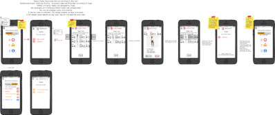
As the designs progressed, we created higher fidelity prototypes in Adobe Illustrator. We also conducted live walk-throughs in our Retail showroom, to understand how the entire experience would flow.

Lastly, we tested the final version of each app on the target devices.
Design the User Experience for Visitors: On-Site, Pre-Registration, and Event Registration

Challenge
Keeping track of the people entering and leaving the facility is a critical function for many types of businesses. This includes hospitals, schools, research companies, military facilities, and other operations that require heightened security. Initially, SATO Global Solutions (SGS) created a simple prototype of an iPad-based Visitor Registration app to capture information as each visitor arrived at the facility.
However, we soon realized that this solution would not scale well for customers with large numbers of individual visits, or for those hosting large events when hundreds of visitors would arrive within a short period of time. These use cases would require us to develop Web-based Pre-Registration and Event Registration apps. In addition, since different types of customers have different needs, we knew that all of our solutions would require not only certain standardized features, but also additional features that could be customized for each customer.
The applications I worked on represent the next generation of the prototype shown in this Visitor Management Solutions video at https://youtu.be/ge5WcHVam2A.
Approach
The original Visitor Registration prototype was built as an iPad app with a specific customer in mind. As such, its features were tailored to the needs of that particular company and its industry. The next customer was from a different industry and had very different needs, so the prototype required significant rework to be suited for them. In order to bring a full-fledged product to market, we knew we would need to develop a more robust design that could easily be adapted to different industries, as well as different companies within the same industry. Our design would need to take into account reusability, customization, scalability, and eventual internationalization.
We started by engaging a consultant, who shared key insights on visitor management, simple ideas for making facilities more secure, and ways to use visual cues (such as color-coding and dates on badges) to make it easy for everyone to know who belongs at the facility and when and where each visitor is entitled to be.

Next, we mapped out the workflows for registering different types of visitors (such as employees, contractors, vendors, residents, guests, etc.) in different types of companies. For example, most adult visitors will have a driver’s license that can be scanned, but school children or foreign visitors may not. Then we identified which Visitor Registration features were common across all companies (for example, collecting the visitor’s name and the purpose of their visit), which could be optional (capturing a photo or biometric information, or adding holograms or other tamper-resistant features to badges), and which should be customizable (the type of badge or wristband that each registered visitor receives).
Results
Based on these decisions, I began creating a list of the required assets (such as company logo, background image, and any non-disclosure agreement or waiver) and desired features (such as fingerprint or eye scanning) that Sales would need to request from each customer so that we could customize the Visitor Registration app for them.
We followed a similar process in the development of Pre-Registration, a Web-based app that lets employees pre-register individual visitors. This app sends each visitor a calendar appointment and instructions, and can also include optional details such as parking information, etc.
The Event Registration flow includes an email invitation, with a link to a website where each invited visitor completes his or her own Pre-Registration. For those who successfully complete all steps of the process, badges can be printed in advance and waiting at a check-in table at the event. Any visitors who arrive at the event without completing all of the steps online can be redirected to a different table to finish registering and receive a badge.
In addition to the workflows for registering a new visitor, we also designed flows for viewing and updating existing registrations.
Design the User Experience for Mobile Workspaces
Challenge
Citrix Workspace Services (later renamed Citrix Workspace Cloud) marked the company's entry into the nascent market for mobile workspaces. My team was initially tasked with developing the administrator and end user experiences for a scalable platform that would automate the creation and delivery of secure desktops and applications "as-a-Service" on the customer's choice of public or private cloud or hybrid datacenter infrastructure.
Our goal was to accelerate the market adoption of mobile workspaces by enabling Citrix partners, enterprises, and independent software vendors to meet the needs of their administrators and end users by providing choice, versatility, extensibility, and a great user experience. Research taught us that Administrators wanted a unified platform for designing and managing Citrix solutions, quick and easy delivery of different workspaces to different groups of users, the low cost and complexity of cloud-based control, and an "evergreen" deployment model that ensured they always had the latest version. End users wanted the increased agility and productivity that come from having secure access to their hosted applications and desktops anytime, anywhere, on any device, with the high-definition experience they'd come to expect from Citrix.
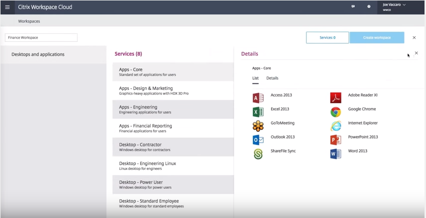
This project had many complexities and unknowns: It was an all-new platform, connected multiple Citrix products (including some from companies that Citrix had only recently acquired), interfaced with third-party infrastructure, and would require new development processes and delivery mechanisms. Since Citrix would provide the workspace management control plane as a cloud service but allow customers to choose the infrastructure, operating system, application management, and user-facing entitlement layers that met their end users' needs, our workflows and user interface would need to be able to handle all of the possible variations. Futhermore, being in a nascent market, we knew that the initial product positioning and market messaging would likely need to change as we continually assessed customer response, the adoption curve, and competitive pressures.
Approach
As with any design project, my team began with research, requirements gathering, and persona development. From there, we created user stories in TargetProcess, workflow diagrams, and wireframes. We developed experiences for every stage of the customer journey: Awareness, Knowledge, Trial, Purchase, Initial Deployment, Usage, Expansion, and Advocacy.
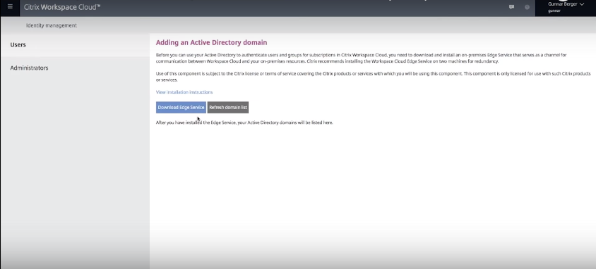
Because of the nature of the product, many workflows were technologically complex, and required lots of back and forth between the Design team and the Product Architects. On multiple occasions, the issues that we Designers raised caused the Architects to rethink or refine their plans. For example, my team expended significant effort streamlining the experience for acquiring and using an on-premises edge server to securely communicate with the customer's Active Directory.
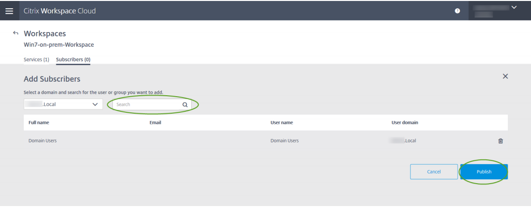
Another lengthy discussion involved Search - specifically the mechanisms for searching for and displaying users when creating subscriptions to workspaces.
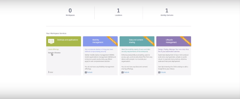
Future-proofing was also a big concern on this project. Although the initial release would support only desktops and applications, we knew that over time the catalog of offerings would to grow to encompass additional types of services. Two related experiences that we explored were how best to whet the customers' appetites, and how to enable customers to try out new services.
One particularly difficult experience to design for was the feature canary. Every 2 weeks, we would be releasing a new version of Workspace Services. Since the services were cloud-based, we needed a way to roll out changes to a small number of customers first (the proverbial "canary in the coal mine"), so we could be alerted to any problems before they impacted a large number of users. If everything went well, we would progressively migrate more customers to the new version in phases, until all customers were on the new software. If a serious problem arose, we also needed a way to roll customers back to the last stable version. Since at any given moment there could be two versions of the product live to different groups of customers, we also needed a way to tie all product content to the correct code base, so customers would only see information that matched their version's functionality.
Results
In addition to my regular role on the User Experience Design team, I was also hand-picked by Marketing to fly out to California to facilitate a multi-day Customer Journey Mapping workshop. Over the course of 3 days, I helped the various Marketing teams plan their collective and individual deliverables for addressing the needs of business and technical users, both leading up to and after product launch. In the process, we uncovered possible future features, which I relayed to the Design and Development teams.

Pioneer an "End-to-End Approach" to User Experience Across the Customer Journey

Challenge
Planned as a major upgrade from Citrix App Studio 1.0, App Orchestration (AO) 2.0 was expected to provide a simple, unified way for customers to manage Citrix application and desktop delivery technologies for multiple tenants, using multiple datacenters, across multiple domains.
Citrix selected AO 2.0 as the pilot project for company-wide efforts to fundamentally change the way Citrix designed, developed, and delivered its products. As a leader of the Information Experience team (part of Customer Experience), I was tasked with analyzing users’ needs and tasks at each touchpoint along the customer journey, so the project team could provide the scaffolding and experiences to support them in successfully moving to the next stage.
Since Citrix was moving to an Agile development methodology, it was also crucial that we be able to deliver functional product updates every 2 weeks.
Approach
I reached out to Product Managers, Architects, Developers, Marketers, Sales, Readiness, Support, and Education staff to begin to understand the issues facing customers at each step of their journey. What made some continue on, while others dropped off?
After gathering some initial information on the customers’ needs, challenges, and constraints, I co-facilitated a workshop where stakeholders gathered to document the current experience and brainstorm the new desired experience. At the end of the workshop, we grouped the ideas to create affinity diagrams identifying key themes. Next, I co-created storyboards to illustrate some of the challenges our customers and potential customers face, and how we envisioned AO 2.0 would help.
After validating the storyboards with key stakeholders, we focused on what needed to happen at each step along the way, and what information customers needed to succeed and progress on their journeys. As part of planning the content strategy and information architecture, I led efforts to conduct a content audit, perform task analysis, and establish a unified taxonomy. The team identified who in the company was best positioned to provide each bit of assistance or information, and we assigned that person the task; at times this meant gaining cooperation from other teams.
Rather than delivering all of the information in one large document like in App Studio 1.0, we divided the content for App Orchestration 2.0 in a modular fashion based on customer tasks, and then further chunked the information to make it easier for users to digest. To assist customers in finding the external content, we provided it on the same web page where they downloaded the AO 2.0 product software.

One key take-away for the team at this stage was that frequently making users context-switch away from using the product to look for assistance in a separate help system or external documentation was distracting to customers and often ended unsuccessfully. To overcome this challenge, our Interaction Designers, Visual Designers, and Information Designers worked together to seamlessly integrate content into the overall user experience. I was responsible for all UI content deliverables.

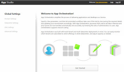
For example, the Customer Experience team worked closely to integrate usage information into the design of the user interface, such as the introductory information shown here from an early iteration of App Orchestration 2.0:
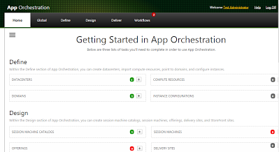
On other screens, we designed the UI to provide customers with a clear context for understanding where they were and what they needed to do next.
Since App Orchestration integrated and built on many previously separate Citrix products, we quickly discovered instances of conflicting or confusing concepts and terminology. As a result, we devoted extensive efforts to crafting a unifying taxonomy. And, to help customers learn the new concepts, we made sure to provide an easy way for them to access definitions of key terms from within the product interface.
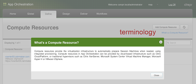
In the process, we identified some in-depth technical information that really needed to be written by senior-level architects and developers. Unfortunately, many of those individuals didn’t feel comfortable serving as Technical Writers. So we developed a new model of “curating” content – where the subject matter expert took a first crack at it, and the Information Development staff asked questions to draw out additional information, fleshed out the content, and performed final editing and formatting. Information Developers checked-in frequently with the original authors and other stakeholders, to rapidly iterate on new revisions and always have the content in a deliverable state in time for the next Agile sprint.
We also introduced non-traditional ways of conveying information to customers, such as via welcome emails, posters, and a series of videos.

Next, we developed a staged approach for usability testing, starting with early alpha versions of the product. Every 2 weeks, participating customers would receive the latest version of the product, along with the information needed to perform a single task: Install the software, Configure App Orchestration, Define the infrastructure, Design an application, and Deliver a subscription to a user. As each customer attempted to perform that week’s task, our product team gathered to observe. Any difficulties or failures were noted and quickly remedied before the next customer attempted the task.
Lastly, based on the enthusiastic responses to our initial videos from early customers, we embarked on a usability study to determine the best format for delivering video content. In addition to the traditional "talking expert" format, we experimented with sketching and cartooning as we developed and tested alternative low-fidelity prototypes:

Results
For App Orchestration 2.0, I co-facilitated 3 Design Thinking workshops (one for AO, and 2 for related cloud products). Based on the results of those workshops and other research, my team and I created the personas, workflows, paper prototypes, wireframes, user interface, technical documentation, and marketing and training videos. We also conducting ongoing usability testing, updating the product for a new release every 2 weeks.
Throughout this release, I worked closely with the Product Manager, Marketing Manager, Product Architect, Developers, Readiness staff, and my Customer Experience colleagues to plan and implement a holistic and ongoing information campaign covering the entire product life cycle, including email messaging, web pages, in-product content, and external documentation.
We also designed an all-new mechanism for delivering external content. This required not only determining what types of information our customers needed, but also the best format for presenting each piece. We had to develop new processes for creating and maintaining the content, since the company’s existing distribution platform could only handle a single format type. To achieve this, my team forged new relationships with organizations throughout the company, up-leveled our skills, and overcame resistance to change.
In total, my team planned, authored, and curated 15 pieces of external content, including new types such as posters. To ensure an integrated end-to-end user experience, I was also responsible for marketing and technical videos (including creating the scripts, recruiting on-screen and voice talent, recording, and editing). In addition, I provided input into Technical Marketing's Reference Architecture.

Improve Process for Parking Lot Traffic Flow

Challenge
The Ann Storck Center provides day and residential services to children and adults with developmental disabilities. Many of their clients use wheelchairs or require other mobility assistance, so making sure that drop-off and pick-up at the facility run smoothly and safely are prominent concerns. Due to the layout of their buildings and parking lots, the center experienced daily frustrations and even a few fender benders. As part of an overhaul of their safety and security systems, Ann Storck needed to improve traffic flow - without losing any of their limited supply of parking spaces.
Approach
On my first visit to the site, I focused on getting an overview of the facility and its programs, meeting some of the staff and learning about their clientele. On subsequent visits, I looked more closely at the traffic flow and parking situations, including how and when each area was being used.
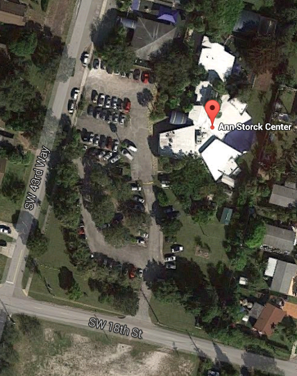
Based on the center’s needs and overall plans, we decided to immediately implement some inexpensive short-term fixes, and then design a more elaborate longer term renovation and repaving project.
Complicating matters was the fact that many of the adult clients arrive in specialized minibuses. During peak drop-off and pick-up times, the queue extends out into the roadway and impedes traffic flow there. Also, the Ann Storck preschool is adjacent to the adult day building, so parents need to park in the lot between the adult day and preschool buildings to escort their children into school.
I brought in a contractor who specializes in pavement striping, and we worked with the center’s administration and staff to design a more appropriate traffic flow pattern. I suggested that by rerouting the adult day queue through an existing entrance a few yards around the corner, we could contain the drop-off and pick-up traffic on property. I also noticed that the pavement narrowed as it approached the unloading zone, and confirmed that this was the site of daily bottlenecks and a few incidents. I proposed that by digging up a signpost and repositioning it just a few feet away, we could open up the flow of traffic. The contractor and center staff agreed and the sign was quickly moved.
Next, we considered how to separate the adult day care traffic from the preschool parking lot. Noticing some large buckets with poles nearby, I suggested we experiment with using them to create a barrier to keep the minibuses from driving into the preschool parking lot. After we moved them into place, one staff member raised a concern about the turning radius required to exit via the new pathway. We recruited some mini-bus drivers to drive the route, and noted where they needed to start to make the turn. The contractor sprayed temporary markings on the ground, and we positioned a sign post nearby as a guide.
Soon it was time for our first official test run to validate the new traffic flow design. Some of the mini-bus drivers were initially annoyed at needing to follow a new pathway, but when staff explained that it was designed to save them time and keep their passengers safe, the drivers quickly accepted the changes.
Results
On the very first day, the new traffic pattern reduced pick-up time by 20 minutes! The center ran with the new pattern in place for a few weeks, with consistently good results: more efficient drop-off and pick-up, reduced driver frustration, and improved safety for all (zero incidents). Once everyone was satisfied with the new flow, we called the contractor back in to finalize the markings. As an added benefit, switching to the new entry point also freed up room for a few additional parking spots near the original entrance!
Guide Start Up to Consensus on Mission

Challenge
SATO Global Solutions (SGS) is a start-up subsidiary of SATO Holdings, a Tokyo-based global leader in automatic identification and data capture solutions. SGS develops customized solutions integrating cloud-based software with the optimal hardware, consumables, services, and support to meet each customer’s specific needs.
During my interview with the company, it became apparent that key personnel had significant disagreement on the startup’s mission and focus. I offered to facilitate a discussion, and they accepted – on the spot! With that, we wrapped up my interview and immediately got to work.
Approach
I began by inviting each of the representatives from Corporate Communications, Marketing, Business Development, and Engineering to share his or her thoughts, as well as the rationale behind them. The information flowed, and covered not only the company’s mission, but also the markets and customers they envisioned serving and the types of products and services to offer.
After drawing out everyone’s perspectives, I highlighted for the team the areas of agreement and the main points of concern. Next, I facilitated a brainstorming session, encouraging them to build on each other’s ideas. Based on the information gathered, I demonstrated possible ways to achieve common ground. Once the team agreed on the basic concepts, I proposed wording that better captured the desired connotations while avoiding the limitations of other terminology. As an added bonus, I was able to suggest options for integrating key messaging from the parent corporation.
Results
At the end of the 2 hour session, SGS had a draft mission statement, and I had my next job with SGS. With a few minor wording tweaks, the mission statement was finalized. Despite significant changes in the company’s primary target markets and product offerings, the mission statement remains relevant and accurate.

Create Website and Other Content to Support Company Launch
Challenge
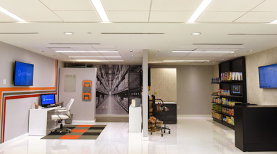
After the mission statement was finalized, the next challenge for SATO Global Solutions (SGS) was to develop presentations and other materials in preparation for the company’s Grand Opening, which was only 3 weeks away!
Hundreds of community and industry VIPs would be on-site for this event, along with representatives from the parent company and its other subsidiaries. SGS urgently needed accurate and informative materials to introduce the company to them, as well as to third-parties who would hear about company from press releases, media coverage, and other sources. Creating these materials was predicated on reaching agreement not only on the target markets and typical use cases, but also on the primary audience (business vs. technical) for each.
A few pieces of marketing collateral already existed; however, they lacked coherency and contained technical inaccuracies and would therefore need to be rewritten from scratch. An outside firm had been contracted to code the website, and since they had already built a basic layout, the website content would need to fit into that format. Lastly, since employees would be conducting demos of the technologies in our 4 showrooms, scripts would need to be written to keep the demos within the allocated time limits and ensure they were delivered consistently.
Approach
My first priorities were to learn more about the company, and gain a better understanding of the target markets and users. I accomplished this in 2 ways: by collecting information from stakeholders within the company and through outside research.
Prior to my official start date at SGS, I collaborated with the User Experience Architect to plan two workshops to gather information on the 4 primary industry verticals the company had decided to target for the Grand Opening. Working together, we developed and distributed a questionnaire to senior staff members. On my first day with the company, I synthesized their responses. Over the next 2 days, I facilitated team workshops to digest, discuss, and build on the results. One surprising insight was that one of the 4 proposed “verticals” was actually a “horizontal” business function that spanned multiple industries!
In between the workshops, I researched our parent company, competitors, key technologies, and over 20 potential secondary industry verticals to come up to speed on the technologies and better understand our core competencies and competitive differentiators

Based on the data gathered, I led the team to a consensus on our initial markets, products, and services for the Retail, Food Service, and Healthcare industries. Our assessment of the levels of technical and business acumen of expected visitors dictated the appropriate tone and depth for our content, including the realization that we needed to provide a basic explanation of each of our key technologies: what it is, how it works, what it’s good for, and why SGS is the vendor of choice.

With these issues resolved, I put together a plan prioritizing work for Phase 1 (Grand Opening), Phase 2 (immediate next steps), and beyond.
Results
The team agreed that having the website content ready for the Grand Opening was our #1 priority, to ensure we had a presence for people to follow up with us after the event. Working closely with the website company, I designed an information architecture that fit the existing structure.

Next, I authored all of the content.
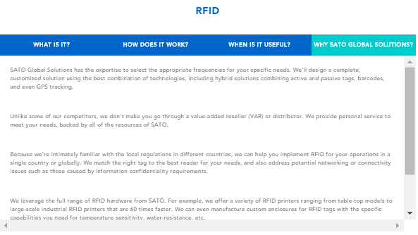
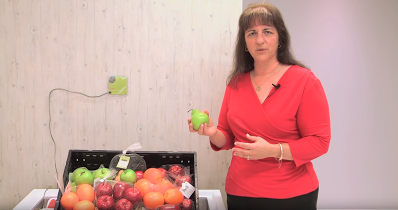
Since Grand Opening was an on-premises event, I also arranged for our new website to be running on an interactive touchscreen during the party. In addition, I prepared key messaging for the Registration area, and even wrote the announcements that were broadcast by the emcee during the event. Lastly, I worked with the subject matter experts to develop the scripts for the live demos that were given in each of the 4 interactive technology showrooms.
Identify Strategic Market Opportunities

Challenge
My next assignment at SGS was to familiarize myself with additional industry verticals - to explore opportunities, recommend where the company should target its limited resources, and help develop products and solutions to meet the needs of those customers.
Approach
This was a research-intensive project, requiring me to gather information from both internal stakeholders and industry sources.
Results
Based on this research, I built out use cases and recommended strategies for monetizing and targeting the best opportunities in industries as varied as Logistics, Hospitality, Diamond & Jewelry, and Law Enforcement & Security.
I began by interviewing subject matter experts from Corporate Strategy, Business Development, Marketing, Sales, and Engineering. Not surprisingly, each of them had different visions, expectations, and concerns. From their combined knowledge and insights, I learned more about our core technologies, corporate priorities, and key differentiators. In parallel, I researched what was going on in a number of potential industries, including information on their users, operating environments, key pain points, the types of solutions we could offer, and the competitive landscape. As part of that effort, I travelled to Baltimore to attend UDI conference 2015, to evaluate whether the new U.S. FDA regulations for Unique Device Identification of medical devices (and similar efforts in other countries) represented a good opportunity for SGS.

I also recommended that we videotape the demos of each showroom and our subsequent pilots, for three reasons:
To broaden their reach beyond the customers who visit our Fort Lauderdale office
To enable Sales to show the demos without Development assistance
To allow the parent corporation and other subsidiaries to begin ramping up the demand pipeline.
Once we achieved consensus, I planned the video production schedule and provided direction on the scope and scripts. When last-minute circumstances required, I appeared briefly in some of the videos.
I also assisted Corporate Communications by contributing to press releases and other publicity pieces, providing content for the parent company’s Annual Report, and giving feedback on process documentation. In addition, I cultivated partner relationships for joint projects and trade show participation.
Redesign Onboarding Process to Improve Customer Retention

Challenge
This company developed cloud-based software for small-to-midsized businesses in a niche market, and was experiencing high customer cancellation rates within the first 90 days after purchase.
The large investment of employee time during the Sales and Onboarding cycles constituted a huge sunk cost for the company, while the number of dissatisfied former customers represented looming prospective costs as they shared their negative experiences with industry colleagues.

Approach
As the first User Experience Designer ever hired by the company, I was tasked with supporting 4 Product Managers and 4 Development teams in the tactical work of designing and delivering new functionality. But just as importantly, I wanted to address some of the key strategic challenges that the company was facing. Retention rates was clearly problem #1.
I began by learning about the industry, and the specific needs, motivations, and pain points of the small-to-midsized business owners who were purchasing the company’s flagship product. For some, this would be their first management system, replacing manual processes and generic tools such as spreadsheets. Others were migrating from the company’s legacy products, or converting from competitors’ offerings.
To get an overview of the company’s multiple existing Sales and Onboarding processes and the hand-offs between them, I met with Sales, Professional Services, Training, Support, and Product Management. Next, I signed up as a new customer to experience that part of the process firsthand. I also conducted site visits and remote discovery sessions with new customers, observed Customer Setup sessions, and listened in on Support calls.
It quickly became apparent that there were multiple problems with the existing processes. In some instances, Sales was pitching a solution that was not optimal for a particular customer. In other cases, customers did not fully understand what data could be converted from their existing systems, what data would need to be manually reentered, and how much time those two processes would take. In addition, when the customers finally did get access to the system (following any migration or conversion and the initial Setup), they were not trained well enough to be productive. This additional downtime was a huge source of frustration, especially for the 1- or 2-person firms who risked losing business while they were unable to service their clients.
Results
After thoroughly investigating the problem, 2 things were clear:
· We needed to do a better job of managing customers’ expectations, especially regarding the way their existing data would be converted or migrated. This went a long way towards alleviating customer frustration.
· We needed a more formalized handoff of customers between Sales, Professional Services, Training, and Support.
I worked with Product Management to better define which customers were good candidates for purchasing this product. Next, I brainstormed ideas with Professional Services on how to more clearly convey to customers what data would and would not convert. Together with Support, we developed and implemented a 30-60-90 day plan that included clearer expectations, changes to the setup call, an assigned Trainer, detailed Learning Plans, and a smooth hand-off to Support.
Within 60 days putting the new plan in place, cancellations decreased by 56%!
Develop Robust System for Self-Service User Assistance

Challenge
One of the first things that I noticed after joining the company was that, for its size, the company received a lot of Support calls. Based on my initial investigation, I determined that multiple factors were at work:
· Customers had been trained to call Support whenever they needed information.
· Due to organizational silos, other options for getting information were scattered and only accessible via separate processes and delivery mechanisms.
· The existing online Help was difficult to navigate and didn’t always contain the information customers needed. Even when it did, only text-based content was provided.

This situation was problematic, both from the perspective of customers who had to wait to get help, and the unnecessary expense and negative impact on reputation that the company was incurring for all those extra Support calls. Through Design Thinking and user-centered design, we set out to craft a better information experience. Our primary goals were to enable customers to get the information they needed faster and more efficiently, while also weaning them off of the need to call Support by providing and promoting better self-service options.
Approach
I began by adopting a multi-pronged approach to understanding why so many Support calls were coming in. I listened in on incoming Support calls, analyzed historical call records, examined Google Analytics data for the existing online Help system, talked with Professional Services, Support, Product Management, and Development, and met with customers. This research provided some interesting insights, which guided me to opportunities for improvement:
· While redesigning the new customer Onboarding process, I had noticed that the Welcome letter from the company CEO specifically directed customers to call Support any time they had a question. Similarly, the Contact Us page on the company website prominently displayed the Support telephone number. Neither venue gave appropriate visibility to other, self-help options.
· The company actually offered multiple self-service options for getting information: Release Notes, recorded webinars, an in-product Feedback mechanism, an online Help website, and an external Training site with Reference Guides, Training videos, and links to register for live classes. Unfortunately, customers had to go to different places to access them.
· A few topics represented a disproportionate amount of the Support calls. In the short term, we needed to provide better Training in these areas. Longer term, we needed to revisit and improve the corresponding workflows and user interfaces.
· Some customers at 1- and 2-person firms liked the interpersonal interaction of dealing with a Support representative. While it was not our intention to completely remove the ability for customers to call Support, we realized that many routine questions could be better handled in group classes that would provide the social interaction that certain customers were looking for in a more cost-effective manner for the company.
Armed with this knowledge, I set out to design the content strategy, information architecture, workflow, interactions, and UI for an all-new, all-inclusive Help system. Prototypes were evaluated and refined based on the results of iterative user testing.
Results
The new system seamlessly integrated the previously separate methods customers had been using to get information. For example, customers can now go to a single “Need Help?” link to find the software version number, see how many licenses they have available, resolve billing issues, submit Feedback, and access online Help topics. As part of the parent company’s move towards platform standardization, this link was implemented as a WalkMe menu, and text-based content was implemented in Madcap Flare.

To make it easier for customers to find the information they need, the new information architecture aligned both with how customers told us they thought about their work, and with what Google Analytics told us about how they used the product. In addition, the new interface provided multiple methods for accessing the information: by browsing, searching, or using quick links to popular topics.
I worked closely with Product Management, Training, and Support to identify the processes that were causing customers the most problems. We created step-by-step interactive WalkMe tutorials for each, and included them as part of the new Help system. To support different learning styles, I also added recorded webinars, Training videos, and links to register for live Training into the Help system, complementing the existing text-based Help content. After analyzing the current state and recent usage levels of the Reference Guides, the team agreed with my recommendation to discontinue them, since it was not cost-effective for the company to maintain them.

Response to the new system was immediately and overwhelmingly positive. Retraining people to use the new system took a bit longer, as we expected. To speed adoption, I taught our Trainers to guide customers to use the new Help system as part of every class. Support staff were also encouraged to “let the customers drive” when accessing information in the new Help system. I also revised the Contact Us webpage and new customer Welcome letter to highlight self-service help options. These changes helped us begin weaning customers off calling Support, while enabling them to get back to servicing their clients faster. Customers benefited from faster answers, a greater sense of competence, and improved ease-of use. Benefits for the company included lower costs and more appropriate utilization of Support staff.
Help Customers Grow Business and Strengthen Relationships

Challenge
Our goal was to help customers grow their businesses and strengthen relationships with their clients by offering a drip marketing campaign feature that’s fully integrated with their management system. This project had a number of complicating factors, including:
· Discovery research for this project revealed that most of our customers fell into 1 of 2 extremes: Those with no marketing experience at all, and extremely savvy marketers currently using a 3rd-party drip marketing product. The former would need a lot of hand-holding and intelligent defaults, while the latter would need help bridging their existing mental models, understanding the unique benefits of trigger-based campaigns integrated with their management system, and possibly incentives to switch to our solution.
· The new feature needed to work seamlessly with existing product functionality. At the same time, it had to be architected so that our parent company’s other products could leverage the design in the future.
· The UI needed to look familiar to our existing users, while also being the first step in a major effort to reskin and update the entire UI of our flagship product. Simultaneously, I was tasked with integrating the parent company’s new design standards.
· The new functionality would be built on the Bootstrap front-end framework, which marked the first time any of our Developers had used Bootstrap.
Approach
Based on extensive user research and competitive analysis, Product Management and I identified 6 key business processes and developed intelligent workflows to automate them. These “smartflows” would enable customers to set up drip marketing campaigns that automated not only sending emails to their clients, but also scheduling follow-up tasks for their employees.
After numerous rounds of ideation and testing, I crafted an end-to-end user experience for “Beginner Bob” users that provided default templates and shielded them from configuration complexity, while simultaneously giving “Savvy Sally” users the ability to completely customize templates and configure the underlying system field-value pairs that governed process automation.

As part of this effort, I proposed, prototyped, validated, and implemented a new visual language for describing campaigns and events. In addition, I developed performance metrics and graphs to provide real-time data visualization reporting on campaign effectiveness. I also worked closely with Developers and our Visual Designer to phase-in an all-new product UI that implemented company-wide design standards and responsive web pages built on the Bootstrap front-end framework. This entailed lots of give-and-take, as we strove to determine the best ways to design around constraints in the existing product functionality while remaining open to possibilities that would emerge as more of the product was migrated to Bootstrap.

Lastly, I collaborated with Product Management to pioneer the company’s first in-product promotion to recruit Beta Testers, which also served as precursor to offering in-product purchasing. This included establishing goals and success metrics for the Beta program (usage levels and $ earned), and conducting preliminary “unboxing” sessions.
Results
To help the Sales team and customers understand the new offering’s value, and to assist Product Management in developing pricing and promotion strategies, I created a feature-by-feature matrix comparing new vs. existing functionality.

Within days, over 25% of our customers had applied to be Beta Testers!
Because the new functionality leveraged data that was already being tracked by the management system, customers were thrilled to learn that they didn’t have to enter their data twice. In addition, their clients were automatically entered into the campaign whenever the applicable triggering event occurred. These, plus our pricing strategy, were big selling points for users of 3rd-party solutions.
The automation aspect was also a game-changer, especially for smaller firms. One customer remarked that it was like gaining an extra employee!
In less than a week, the first Beta Tester reported $9,400 in new business.